If you've ever seen a satellite image of Earth at night, you know it's more than just a beautiful picture. It's a snapshot of humanity's footprint. Those clusters of light are our cities, our economies, and our infrastructure. But a single snapshot only tells part of the story.
What if we could watch those lights change over decades? What if we could see, pixel by pixel, which areas are growing brighter and which are fading? This is the power of nighttime lights (NTL) time-series analysis. It's a powerful proxy for tracking everything from economic growth and urbanization to energy poverty and the impact of conflict.
There's just one problem: the data is *massive*. Analyzing decades of global satellite imagery is a computational nightmare. You can't just download it to your laptop. This is where traditional GIS workflows break down.
In this post, we're going to build a tool that bypasses this problem entirely. We'll use Google Earth Engine (GEE) to process over 30 years of global data on-the-fly, `geemap` to visualize it, and `ipywidgets` to build an interactive dashboard—all inside a Google Colab notebook.
We won't just make a static map. We'll build an application that lets a user select any U.S. state and instantly generate a map of its nighttime light trends, showing exactly where growth has occurred.
Let's get started.
🌍 Part 1: The "Why" - What Nighttime Lights Tell Us
Before we dive into the "how," let's talk about the "why." Nighttime lights data, specifically the DMSP-OLS (Defense Meteorological Satellite Program - Operational Linescan System) collection we're using, is one of the most fascinating datasets in remote sensing.
From the 1990s to 2013, these satellites captured the intensity of light emissions from Earth's surface. By focusing on "stable lights," the dataset is cleaned to filter out ephemeral light sources like forest fires, auroras, or fishing boats, leaving us with a consistent record of human settlements and activity.
So, what can we learn?
- Economic Activity: There is a strong, well-documented correlation between an area's light output and its GDP. Brighter lights often mean more economic activity.
- Urbanization: You can literally watch urban sprawl. The suburbs of cities like Las Vegas or Dallas visibly expand year after year in the data.
- Infrastructure & Energy Access: It provides a stark visualization of energy poverty. You can see the electrified grid of one country stop abruptly at the border of another.
- Conflict & Disaster: Conversely, areas "going dark" are a powerful indicator of disaster or conflict. The most famous (and heartbreaking) example is Syria, where NTL data showed a catastrophic dimming of the country after 2011.
Our goal isn't just to *see* the lights; it's to *quantify their change*.....and it makes for a really cool looking map frankly.
☁️ Part 2: The "Platform" - Why Google Earth Engine?
To analyze 22 years of global data (from 1991 to 2013), we'd traditionally have to:
1. Find and download hundreds of gigabytes (or terabytes) of individual data files.
2. Store them on a powerful machine with massive disk space.
3. Write complex scripts to mosaic, re-project, and stack all these files.
4. Finally, run the analysis... which could take hours or even days.
Google Earth Engine (GEE) flips this entire model on its head.
GEE is a cloud-based platform for planetary-scale geospatial analysis. The simple-sounding premise changes everything: "Bring your code to the data, not the data to your code."
GEE's public data catalog contains petabytes of analysis-ready data, including the entire DMSP-OLS collection. When we write Python code using the `ee` library, we're not running the computation locally. We are building a "recipe"—a set of instructions—that GEE executes on its own massive, parallel-processing infrastructure.
We don't download anything. We just send our recipe and GEE sends back the result, whether that's a number, a chart, or in our case, map tiles.
This is the paradigm shift that makes our project possible in a browser tab.
🔬 Part 3: The "How" - The Core Analysis Explained
Let's walk through the core of the analysis. Our goal is to calculate a **linear trend** for every pixel. For each pixel's location, we have a time series of brightness values (our 'Y' variable). We need to see how it changes over time (our 'X' variable). We're fitting a simple linear regression, $y = mx + b$, for *millions of pixels at once*.
The `scale` (or $m$) will be our **trend**.
- $m > 0$: The pixel is getting brighter (growth).
- $m < 0$: The pixel is getting dimmer (decline).
- $m \approx 0$: The pixel is stable.
The `offset` (or $b$) is the intercept, representing the *initial brightness* at the start of our time series.
Here’s how we build this recipe in GEE:
Step 1: Load the Data and Create a Time Band
First, we load the entire collection and select the `stable_lights` band.
# Load the night-time lights collection
collection = ee.ImageCollection('NOAA/DMSP-OLS/NIGHTTIME_LIGHTS') \
.select('stable_lights')
Next, we need to create our 'X' variable: **time**. The `linearFit` reducer needs two bands: the independent variable (time) and the dependent variable (brightness). We write a helper function to add a 'time' band to every image in the collection.
# Adds a band containing image date as years since 1991.
def createTimeBand(img):
# Get the image's date and subtract 1991 to get "years since start"
year = ee.Date(img.get('system:time_start')).get('year').subtract(1991)
# Return a new image with the time band
return ee.Image(year).byte().addBands(img)

# Map this function over the entire collection
collection = collection.map(createTimeBand)
After this step, every image in our `ImageCollection` now has two bands:
1. `time`: Our 'X' variable (e.g., 0 for 1991, 1 for 1992, etc.)
2. `stable_lights`: Our 'Y' variable (the brightness value)
Step 2: The Magic Reducer: `ee.Reducer.linearFit()`
This is the single most-powerful line of code in the notebook. A "reducer" in GEE is a function that takes an `ImageCollection` (a stack of images) and collapses it into a *single* image.
We use the `linearFit` reducer, which computes an Ordinary Least Squares (OLS) regression.
# Compute a linear fit over the series of values at each pixel.
linearFit = collection.reduce(ee.Reducer.linearFit())
That's it. GEE's servers are now tasked with performing a linear regression for every single pixel on the planet, using the `time` band as the X-input and `stable_lights` as the Y-input.
The result, `linearFit`, is a single image with two bands:
- `scale`: The slope ($m$), our trend.
- `offset`: The intercept ($b$), our initial brightness.
Step 3: Visualize the Trend
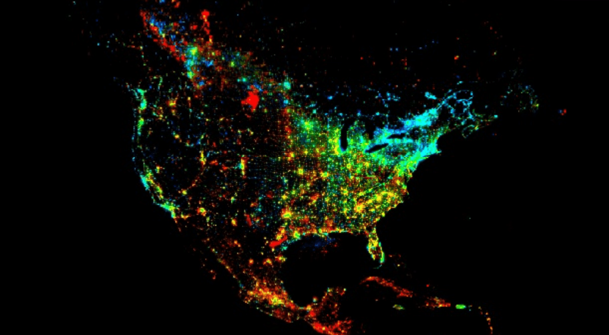
Now we can define visualization parameters to map these results to colors. We'll use a common false-color composite trick:
viz_params = {
  'min': 0,
  'max': [0.18, 20, -0.18],
  'bands': ['scale', 'offset', 'scale']
}
This maps:
- Red Channel: `scale` (positive trend)
- Green Channel: `offset` (initial brightness)
- Blue Channel: `scale` (negative trend, by using a negative max in the `max` list)
This gives us an intuitive map:
- Bright Red/Pink areas: High `scale` (strong growth) and high `offset` (already bright). These are our booming urban centers.
- Bright Green areas: Low `scale` (no trend) and high `offset` (bright). These are stable, established cities that aren't growing or declining.
- Dark/Black areas: Low `scale` and low `offset`. These are unlit, stable rural areas, deserts, or oceans.
- Blue/Purple areas: Negative `scale` (dimming). These are less common but can show areas of economic decline or displacement.
🖥️ Part 4: Building the Interactive Dashboard
We've done the analysis, but the result is a massive *global* map. Now we'll build a user interface to explore it, turning our analysis into a tool.
This is where the client-side Python libraries come in.
- `geemap`: A library by Dr. Qiusheng Wu that brilliantly bridges GEE's server-side power with Python's data science ecosystem. It's built on `ipyleaflet` and gives us an interactive map *inside* our notebook.
- `ipywidgets`: The standard library for creating UI controls like dropdowns, buttons, and text boxes in Jupyter/Colab.
Step 1: Create the UI Widgets
First, we need a dropdown menu populated with all U.S. states. We could hardcode this list, but a much better way is to query another GEE asset: the **TIGER 2018 U.S. States** boundaries.
# Load the TIGER dataset for U.S. States
states = ee.FeatureCollection('TIGER/2018/States')

# Get a list of state names to populate the dropdown.
# .getInfo() pulls the data from GEE's servers to the Colab notebook.
state_names = sorted(states.aggregate_array('NAME').getInfo())

# Create the widgets
state_dropdown = widgets.Dropdown(
  options=state_names,
  description='Select State:',
  value='Nevada' # Set a default
)

run_button = widgets.Button(
  description='Zoom and Clip to State',
  button_style='primary'
)

output_widget = widgets.Output() # To print messages
The most important line here is `states.aggregate_array('NAME').getInfo()`.
- `aggregate_array('NAME')` is a server-side GEE command that collects the 'NAME' property from every feature.
- `.getInfo()` is the client-side command that says "Okay, I'm done defining my recipe. Execute it and send the (small) list of names back to my Colab notebook."
We now have a Python list of state names, which we feed directly into our `widgets.Dropdown`.
Step 2: Create the Map and the Event Handler
Next, we create our `geemap` map and add our global trend layer, but we'll set `shown=False`. It's loaded and ready, just invisible.
# Create the interactive map
m = geemap.Map(center=[40, -98], zoom=4, layout={'height': '600px'})

# Add the full global layer by default (but turn it off)
m.addLayer(linearFit, viz_params, 'Global Trend (1991-2013)', shown=False)
Now, the fun part: we define what happens when the `run_button` is clicked. This `on_button_click` function is the heart of our application's logic.
# Define what the button does when clicked
def on_button_click(b):
# Clear any previous messages
output_widget.clear_output()

with output_widget:
# 1. Get user input from the CLIENT-SIDE widget
state_name = state_dropdown.value
print(f"Loading '{state_name}'...")

# 2. Filter the GEE collection on the SERVER-SIDE
selected_state = states.filter(ee.Filter.eq('NAME', state_name)).first()

# 3. Clip the global trend map on the SERVER-SIDE
clipped_trend = linearFit.clip(selected_state)

# 4. Zoom the CLIENT-SIDE map to the state's geometry
m.centerObject(selected_state, zoom=7)

# 5. Add the new SERVER-SIDE layer to the CLIENT-SIDE map
m.addLayer(clipped_trend, viz_params, f'{state_name} Trend')

# 6. Add a nice outline for context (also SERVER-SIDE)
outline = ee.Image().byte().paint(
featureCollection=ee.FeatureCollection([selected_state]),
color=0,
width=2
)
m.addLayer(outline, {'palette': 'FFFFFF'}, f'{state_name} Outline')

print(f"Successfully added '{state_name}' to the map.")

# Link the button's 'on_click' event to our function
run_button.on_click(on_button_click)
This function perfectly illustrates the client-server relationship. The `state_name` is a local Python variable. This variable is used to build a *new* GEE recipe (`filter` and `clip`) that runs on Google's servers. `geemap` then handles the request to add the resulting tiles to our interactive map.
Step 3: Display the Final UI
Finally, we just need to display all our elements.
print("Map is ready. Select a state and click the button.")

# Display the widgets first, then the map
display(widgets.HBox([state_dropdown, run_button]))
display(output_widget)
display(m)
And just like that, we have a fully functional geospatial application inside our notebook. A user can select "Nevada" and instantly see the explosive growth of Las Vegas (in bright red), or select "Michigan" to see the relative stability of Detroit (in green) surrounded by its growing suburbs.
🚀 Conclusion and Next Steps
What we've built here is more than just a map. It's a template for democratizing planetary-scale analysis. We've taken a petabyte-scale dataset, run a complex time-series analysis on it, and wired the result to an interactive UI, all with about 50 lines of Python. No downloads, no servers to manage, just a Colab notebook.
This workflow is incredibly powerful, and this is just the beginning. Here are a few ways you could take this project even further:
I hope this walkthrough has demystified some of Google Earth Engine's power and shown how, when combined with Python's excellent data science stack, it allows you to build remarkable tools for understanding our changing planet.
🤔 Frequently Asked Questions (FAQs)
1. What does "stable_lights" mean and why did we use it?
The `stable_lights` band is a pre-processed product provided by NOAA. The raw DMSP-OLS data also picks up ephemeral (temporary) lights like forest fires, gas flares, fishing boats, and even the aurora. The "stable lights" product has been filtered to remove these, leaving only the persistent light sources associated with human settlements and infrastructure. This makes it much more reliable for time-series analysis.
2. What is `ee.Reducer.linearFit()` *really* doing?
It's performing an Ordinary Least Squares (OLS) regression *independently for every pixel*. Imagine our `ImageCollection` as a 3D stack (latitude, longitude, time). For a single (lat, lon) coordinate, the reducer takes the stack of pixel values at that one location (e.g., [10, 12, 11, 14...]) and the corresponding time values ([0, 1, 2, 3...]) and fits a line $y = mx + b$ to that data. It stores the resulting $m$ (slope) in the `scale` band and $b$ (intercept) in the `offset` band. It does this in parallel for *all* pixels.
3. Why did we load the entire global map first with `shown=False`?
This is an efficiency pattern. The `linearFit` image is just a "recipe" or a "definition" until we actually try to visualize it. By adding it to the map once (invisibly), it's available as a layer. Our button click *doesn't* re-compute the global trend; it just defines a new layer by *clipping* the existing `linearFit` recipe. This is much faster than re-running the full reducer every time.
4. Can I use this for a different country?
Absolutely\! The `linearFit` image is global. The only part of the code specific to the U.S. is the `ee.FeatureCollection('TIGER/2018/States')`. And that is just for the individual state clips. Otherwise, you can just turn on the Global layer and see the entire globes trends for this timeframe.
5. How can I get more recent data? The analysis stops in 2013.
This is a limitation of the DMSP-OLS dataset. For more recent analysis, you must use its successor, **VIIRS (Visible Infrared Imaging Radiometer Suite)**. The GEE collection `NOAA/VIIRS/DNB/MONTHLY_V1/VCMSLCFG` is a good place to start. You can apply the exact same `createTimeBand` and `linearFit` logic to the VIIRS collection to get trends from 2012 to the present.